Agent Soda: A Soda on a Mission
Objective
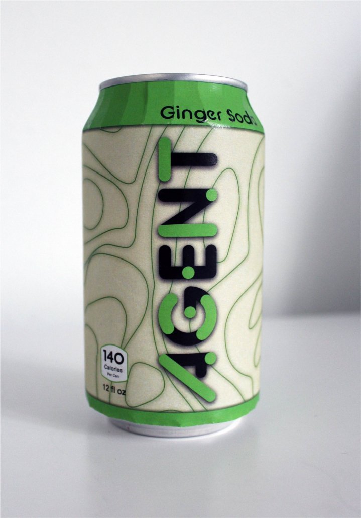
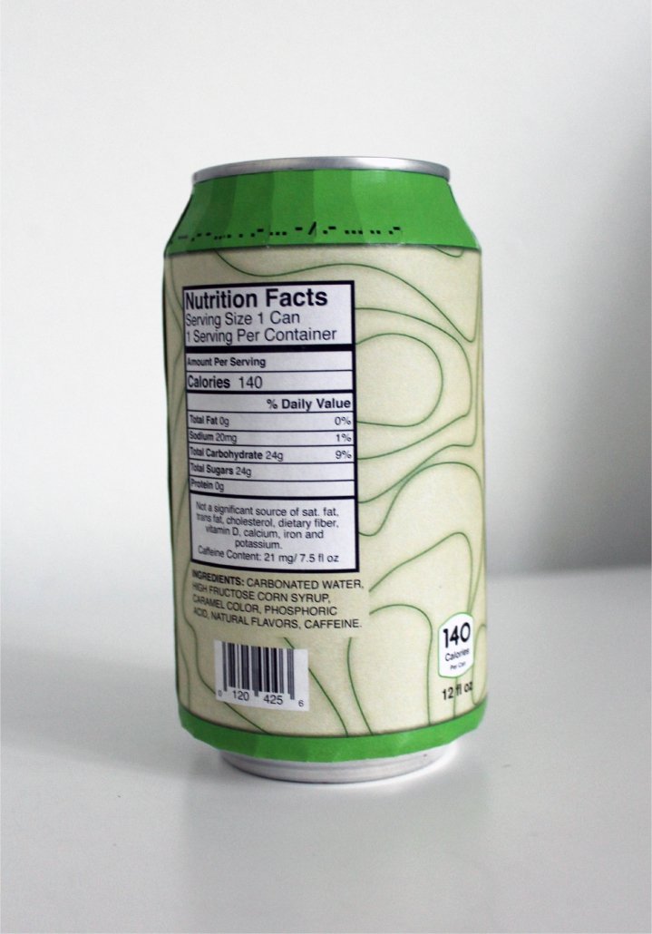
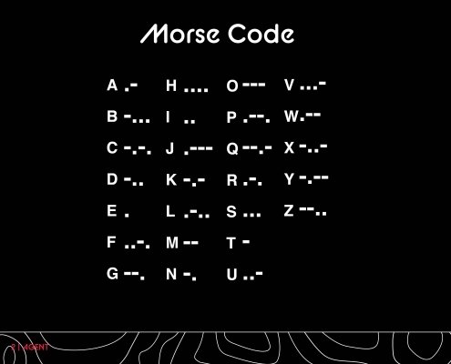
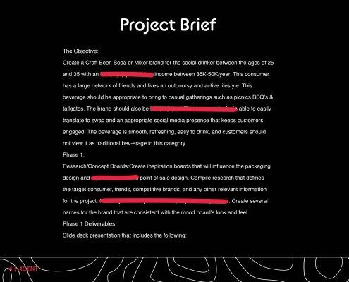
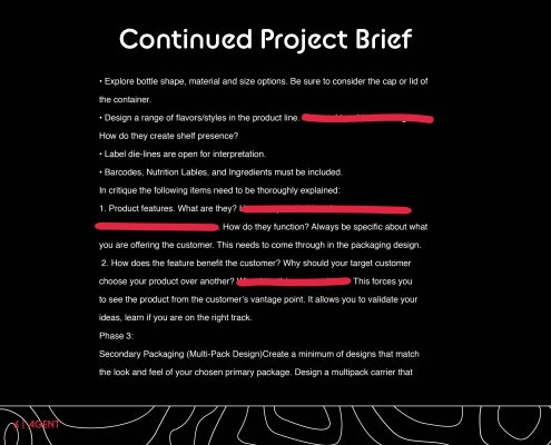
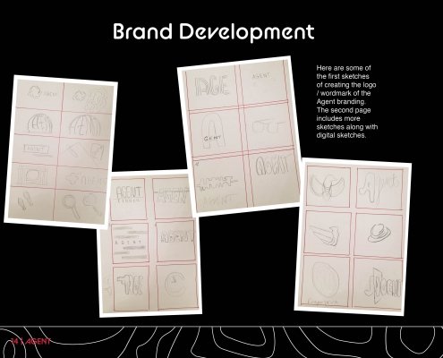
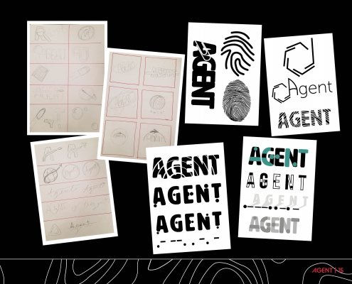
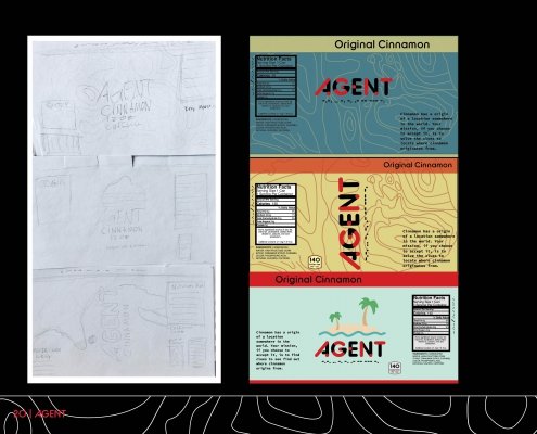
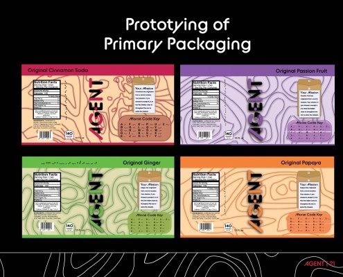
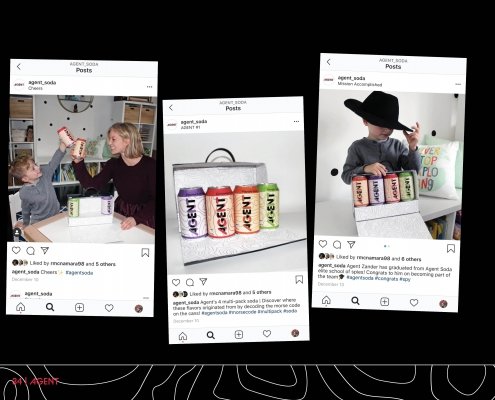
The objective of this school project was to create packaging for a beverage of your choice. As a soda drinker myself, I decided to choose that. Unlike other soda brands, I wanted to market towards children. To do so, I themed the soda as a spy/mystery brand, which allows children to solve the mysteries on the soda packaging. Hence the reason why I choose to call the soda Agent. On the soda cans, there is a mystery to solve that tells the customer where the flavor came from. There is a morse code on the cans along with an area that you can decode to figure out where the flavor originated from. The background design of the cans is the topography of the region on where the flavor originated from. That is why there are different shapes of lines on each can of soda. I also wanted to pick unique flavors to get children’s attention and make it hard to figure out where the flavors came from.
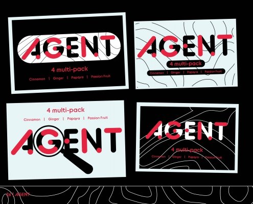
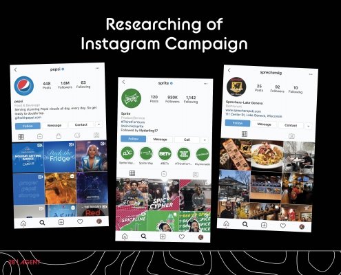
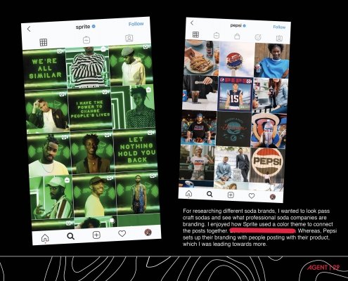
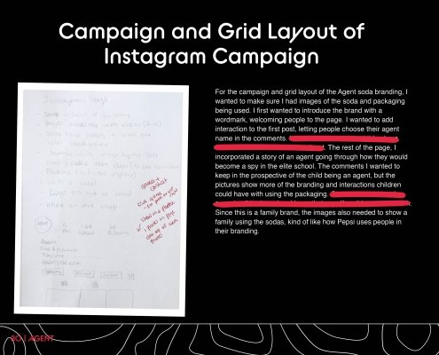
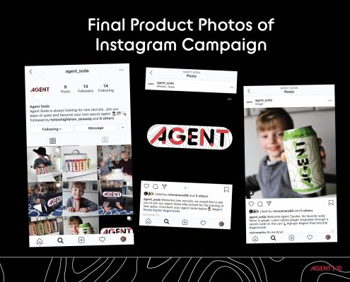
The Instagram account takes a further step into the experience of the soda branding. Lastly, the packaging (box design) represents a suitcase for kids to look like they are on an important mission. Not only that, but the inside of the box is white so children can color it. Overall, I wanted this brand to create an experience for children and make them learn without them realizing it. In the future, I would hope to expand the brand and create new flavors shown through the Instagram.
